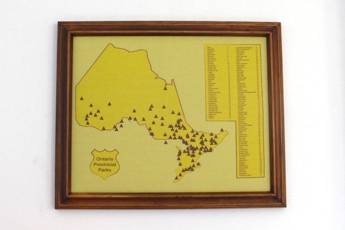
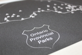
Styled in similar colours to the old Provincial Parks signs
Our interpretation of an Ontario Provincial Parks map came about from suggestions at MakerExpo this fall. Last weekend we took it along to an event where we were displaying the map, and it received an amazing response. After some hesitation I’ve given in and posted it on Etsy. This is the first map I’ve designed from scratch in a while, using pages and pages of maps and provincial park information.
With over 300 parks in Ontario, the question became which parks to include. Those of a certain size only? Or just overnight parks? Ontario Parks themselves seem to declare just over 100 as serviced, and those are the ones featured on our map. Each is numbered, and the map can include a corresponding legend on it, or separately.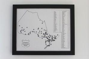
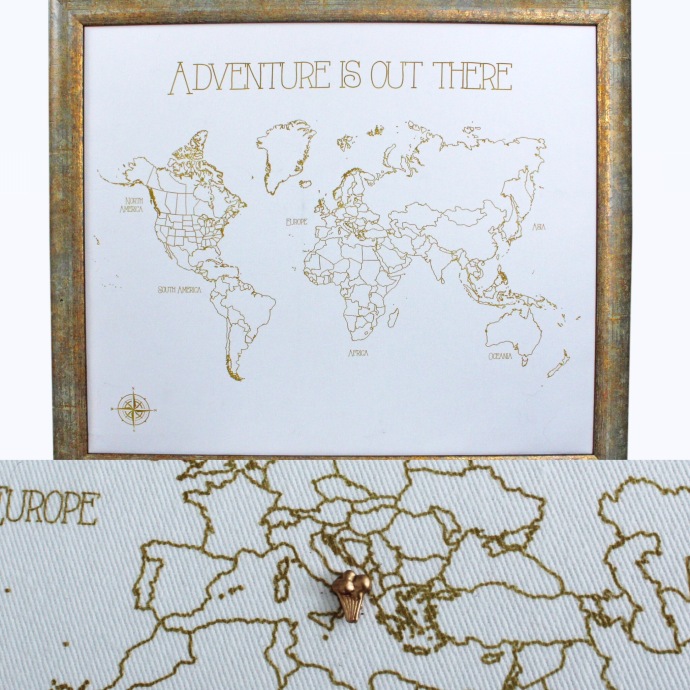
Our maps are all printed on Cotton Twill fabric, designed in Canada. They are hand mounted over layers of cork and cotton batting on a backing. We’re still working on a final mold for our corresponding pins – hopefully we’ll have them ready in a few weeks!
See them on Etsy, follow us on Twitter (@ButterpotDesign) and Instagram @ButterpotDesigns
e